This is one option for the stationery: the letter head, the business card and the envelope for the letters.
The business card has can be used like a puzzle. It has this slots on the edges. This slots are made to hook or to fit in the others slots, from the others business cards.
Nike has become on of those global companies targeted by a broad range of campaigning as a symbolic representation of the business in society. In Nike's case, the issues are those of human rights and conditions for workers in factories in developing countries.
I personally think that besides all this controversies and accusations, it's a fact that Nike's factories employ an enormous number of people, who probably would not have any work at all.
Nike produces footwear, clothing, equipment and accessory products for the sports and athletic market. It is the largest seller in the world (for this type of products). It sells for approximately 140 countries around the world. The company manufactures in China, Taiwan, Korea as well as in the US and Italy. In the face of constant accusations, Nike has developed a considered response to all this accusations about human rights. It now has a well developed focus for its corporate responsibility on improving conditions on contracted factories, aiming for carbon neutrality and making sports available to young people across the world.
UNITED COLORS OF BENETTON
For me, Benetton is a great example of good Corporate Social Responsibility. One of Benetton's latest global ad campaign promotes the Birima micro-credit program in Senegal that receive financial support from the company. This is a co-operative credit society founded by Youssou N'Dour. This campaign features Senegalese workers who have used micro loans to start small, productive businesses. These people become symbols of Africa that uses work to fight poverty, increases its resources and take back responsibility for creating its future. According to Alessandro Benetton, the project emphasizes "the new face of Africa" trough talent, hard work, optimism and interest for the future. This project enhances the community's confidence and guarantees profits and development. In my opinion, this seems to be a good way to fight poverty and therefore is a good project and a good social responsibility.
As a designer our personal social responsability is to create somehing that we believe, that we know is sustainable, that will help people. As a graphic designer, we should take in consideration everything about environmental issues as well as ergonomical issues. We should colaborate with different people, create a social network with different areas of design.
Motion Graphics, as said in the name, are graphics that use video and/or animation techonology to create the illusion of motion.
Motion graphics are usually displayed via electronic media but they could also be displayed via manual techonogy, like flip books.
Saul Bass is probably the most significant pioneer in animated graphic Design and his work marks the beginning of what is now motion graphics. His designs were simple but they communicate the mood of the film.
here are some exemplesof his work:
The Man With The Golden Arm, from 1955:
Vertigo, from 1958:
Anatomy of a Murder (1959)
and some more, like: North by Northwest (1959), Psyco (1960) and Advice & Consent (1962)
Some more motion graphics artists:
Kyle Cooper
Len Lye
Maurice Binder
Norman McLaren
Oskar Fischinger
Pablo Ferro
Stan Brakhage
Roberto Underbob Marsella
Kyle Cooper interview (part 1):
Kyle Cooper interview (part 2):
What are the current trends?
As I was watching different motion graphics videos, I found a similar theme in all of them, a good portion are using effects to make the overall look feel more organic, handmade and just a natural part of the piece. Which in the end is part of what motion graphics tries to accomplish, making it look real when its not. We all pretty much have the same tools in our days, and you don't need to have a master to make motion graphics. It's something that it's available to everybody. There are programs to use, websites with tutorials to help you through the programs and how to make the effects you want.
Another type of motion graphics tha I seemed to find very often is stop motion.
Stop Motion is something very simple to make that only takes time, pacience and creativity!
This is a Stop Motion video made with 222 t-shirts designs. As I said... just need to be creative!
This animated video was adapted from a talk given at the RSA by Sir Ken Robinson, world-renowned education and creativity expert and recipient of the RSA's Benjamin Franklin award.
What does the future holds? Well... it's hard to predict, but certainly more softwares will come, more effects will appear and it will never stop. Some people will prefer something more futuristic but, in my opinion, more people will appreciate and prefer real artists. People who can make more with less, less technology, less electronic effects and more hand craft, more creativity, with real materials and less costs.
As a foreign, I thought it would be an interesting idea to choose the London transports sign system to discuss, because this is made for people like me, that want to discover the city and find out what the city has to offer.
While I was researching, I found this article about Pedestrian Wayfinding Signage:
News Articles
"Transport for London Awards 'Legible London' Pedestrian Wayfinding Signage Contract to Trueform
04/09/2009
TFL's 'Legible London' wayfinding project aims to provide better information throughout the Capital for people who want to walk. A study conducted two years ago drew attention to the ineffectiveness of the present multitude of pedestrian sign systems in Central London, and the consequent over-reliance on the tube map to help navigate above ground.
Trueform will commence the manufacture and installation of these innovative street furniture products early 2009.
Legible London will use a range of information, including street furniture products early 2009.
Legible London will use a range of information, including street signs and maps to provide a comprehensive wayfinding system that helps both residents and visitors alike.
Features of the new wayfinding signage system includes modulisation, robustness, lighting and solar power options, methods of displaying the mapping information and compatibility with potential new communications technology. Each sign has a unique commentary of the surrounding area with useful travel information and a description of the geography of nearby areas."
I completely agree with this article, I find really difficult to understand exactly where am I and how to get to other places. I always end up asking someone, so I hope they change for an easier and clearer wayfinding solution.
But not all the Transport of London's system are like this one.
One of the most cited examples of a well-designed signage system is the London Underground. It is really easy to understand and provides a very comprehensive wayfinding system. Even my mom was saying that the signs in the tube are made for any person to understand - "even the dumbest person in the world" - she said.
Starting with the London Underground Sign, which is really easy to identify! It consists of a red roundel and a horizontal blue bar containing the station name. They are very easy to recognize and very unlikely to be confused or missed. The typeface used on the underground signs, New Johnston, was designed in 1913 specifically for the Underground to provide readability at a distance. It's simple and clear, and so is the hole sign itself, that's why it works!
Not only the London Underground Sign is good. The London Underground map is also very clear and easy to understand. As a foreign, the first time I used the tube alone, I had no problem at all. Everything was very clear and the map really easy to follow and guide me through.
The tube map is a diagram representing the lines and stations of some of London's rapid transit rail systems, the London Underground (commonly known as the tube), the Docklands Light Railway (DLR) and London Overground. As a schematic diagram it shows not the geographic but the relative positions of stations along the lines, stations' connective relations with each other and their fare zone locations, for that, the map has a background shading to signify the areas for each of the tariff zones. The basic design concepts help people to understand, in an easy way, where to go and how to get there.
Inside the tube stations it's also very easy to orient yourself and navigate from place to place without getting lost. Everything is clear and signed. If you want to go out of the station you follow the signs: way out! The sign Way Out have different typefaces and different designs. But they all serve the same purpose, guide you to the exit. They are placed all the way to the exit, there's no way you can missed them!
If, instead, you just want to change to another line, let's say, from the bakerloo line to the central line, there are signs, with the color of the line you want to go, that indicates the way. There is an example in Oxford Circus:
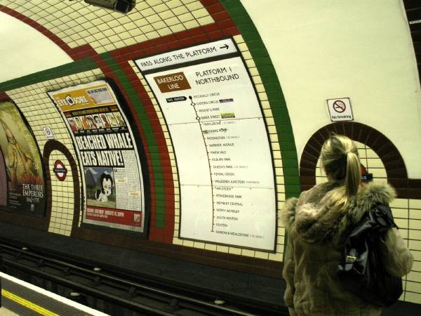
If you want to go to a certain station and you're not sure which platform you have to go (either northbound or southbound) before you go the the platform there are signs with the list of stations in each platform (southbound or northbound) and the station where you are is marked with a blue box, as the following pictures will demonstrate:
Because safety is really important, there are also typographic and sound signs to make people aware of the gap between the train and the platform that say: Mind the Gap And it does work. It works so well that the sound and type "mind the gap" became a symbol of London!
Let's say, if you're in one station and you don't remember where should you change to the place you want to get, and you need a map, there are, in all the platforms, a general tube map with all the links to other tube lines, trains, DLR, overground and trams. Moreover, you have a map of the outside zone of the station you are in, with the bus connections you will find outside the tube station and some touristic places, such as museums, galleries, touristic attractions, some useful numbers, such as police number, emergency numbers and more.
Also, inside the tube you can find the general tube map, as well as the line you are traveling with the name of all stations inthat line. It's a really good way to keep you knowing where you are, how many stops until the one you want and which links exist in every single stop.
Because sometimes the tube gets really busy, specially close to Christmas time, sales and pick hours, there are signs to indicate people how to move inside the tube, like: Keep Right or Keep Left.
I must say that this signs really help. In Portugal we don't have this signs and its chaotic in the pick hours and on the most busy areas!
So, as a conclusion, I really understand why one of the most cited examples of a well-designed signage system is the London Underground. It is easy to identify, to navigate from place to place and to orient yourself inside the tube.
ITC Bauhaus was designed by Edward Benguiat and Victor Caruso in 1975.
I chose this typeface because it's a simple and rounded typeface which I really like. It has open end stroke, it's still very modern, although it was created in 1975 and it's clear.
I read that Bauhaus Heavy was first created to be a display-only design and it was made with a Bauhaus Outline. But the Outline version was dropped from the family, while the Bauhaus Heavy was made part of the now text/display offering.
BODONI
Bodoni is a series of serif typefaces first designed by Giambattista Bodoni in 1798.
Bodoni typeface followed the ideas of Baskerville typeface, created by John Baskerville. Giambattista Bodoni admired the work of John Baskerville and studied in detail the designs of French typefaces founders. But, despite of this inspirations, there is no doubt that Bodoni found his own style for his typefaces which gained a huge acceptance among printers.
Bodoni has a thicker stroke that contrast more with the thin strokes and is more vertical than Baskerville. It is said that this font suffers from legibility caused by this contrast between really thick and really thin strokes, specially the thin strokes for being so thin at small point sizes.
I personally like this typeface. It looks elegant and simple but I wouldn't use for something that needed to look very trendy. I would use more for traditional things, like newspaper, theaters, etc... something more preservative.
Typography in public places! I thought about creating something with a theme, and so, my theme was the traffic lights and so collecting typography in Yellow, Red, and Green!
I also had to choose 5 specific pictures, and there they are:


